Client Case: Boerderleren — Studio Hyperdrive
- #digital
- #experience
- #app
- #desktop
- #mobile
- #UX
- #UI
- #2D
- #3D
- #animation
- #development
Wondering how we craft entertaining and educational app experiences? Let’s connect!
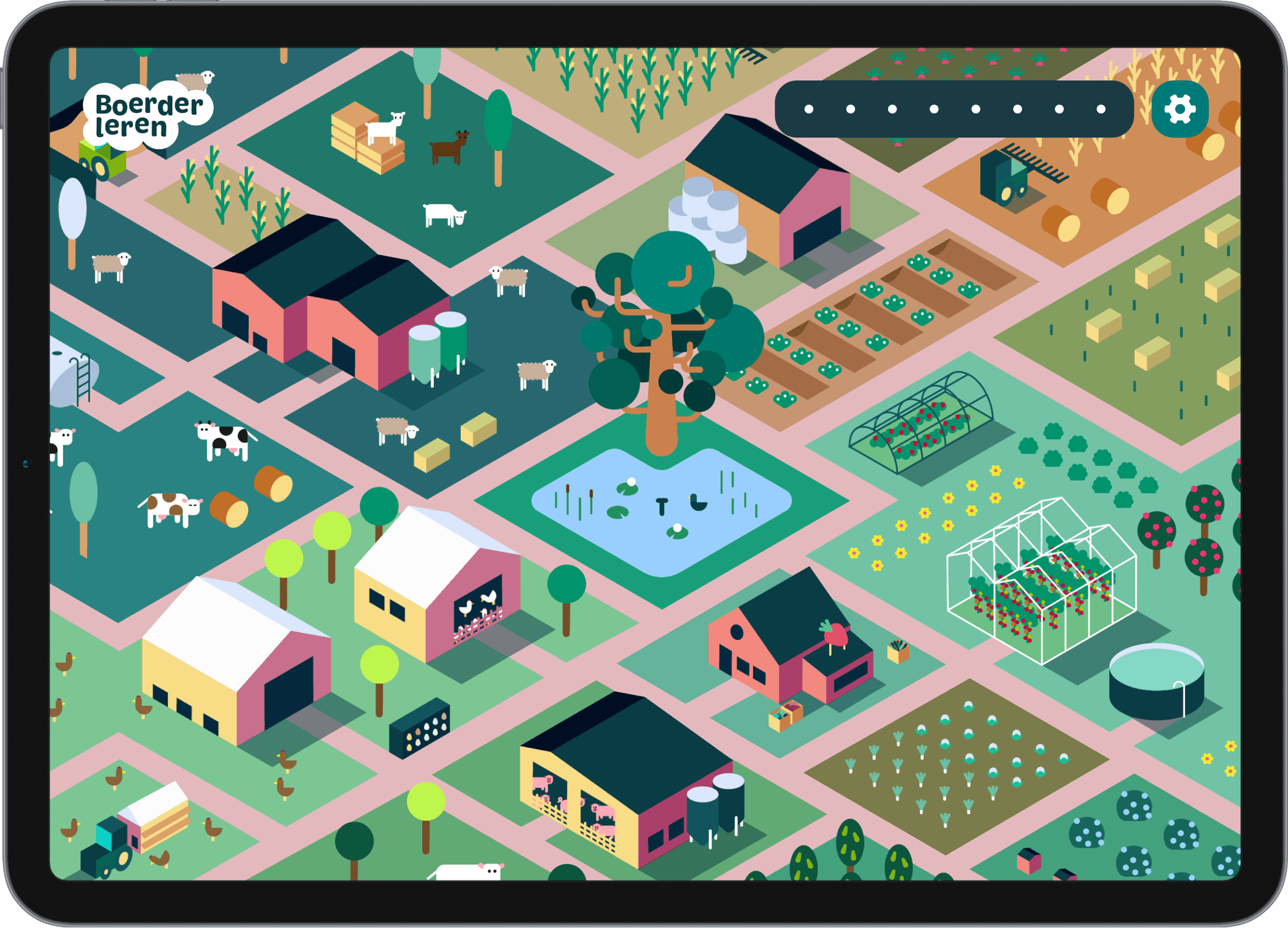
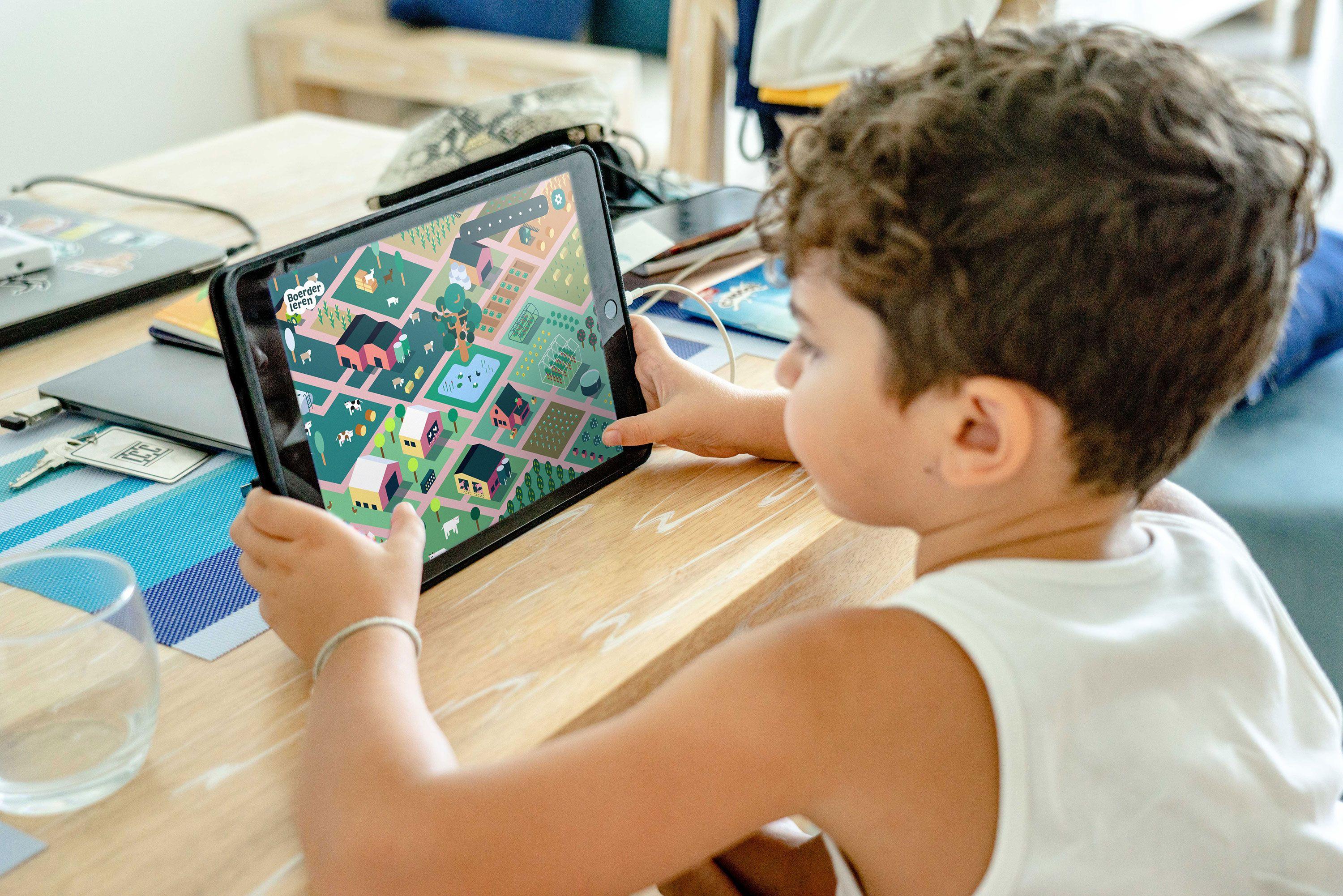
With Boerderleren, kids are welcomed into a 3D map full of different farms. They can unlock them one by one, fulfill missions and become agricultural know-it-alls.
To give every kid the same experience and ease of use, we had to make sure the application was free of any hurdles. We focused immensely on accessibility, by creating concepts without any complexity.

Two-sided challenge
The app had to give city kids a window into a world they aren’t familiar with and push them to explore it. But to do that, we had to really step into their minds and create something that would spark their interest.
Meanwhile, teachers needed a modular application. Something that they could mold to the specific needs of their pupils, and their unique approach to teaching.
For this, the app needed to be as accessible as possible. Because with big classrooms full of easily distracted kids, teachers can't afford to lose time.

Effortlessly manageable
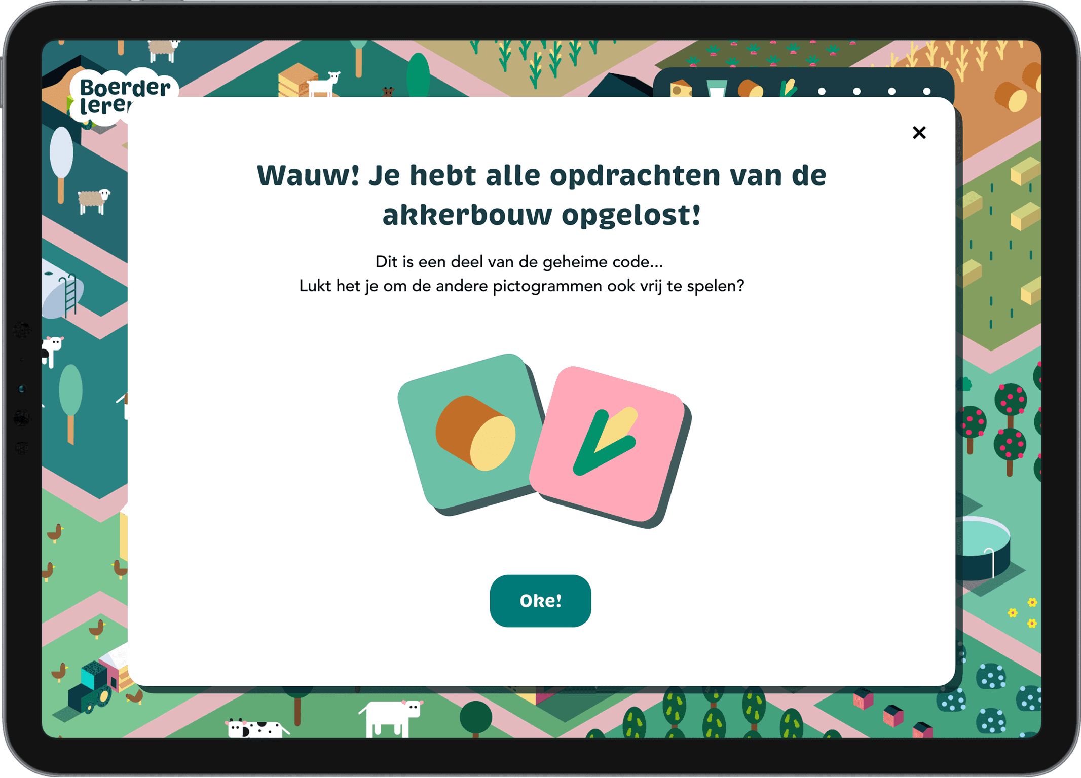
Teachers have to be able to switch gears instantly and easily. So we made the application truly as flexible as possible, cutting out all complexities of entering codes, invitations, or setting up configurations.
Secondly, we set up the game loop to be very simple and transparent. Creating a truly unique interactive experience, which tickles kids' curiosity and makes them want to continue to explore the application.
"A minimalist style full of color & character brings it together.”
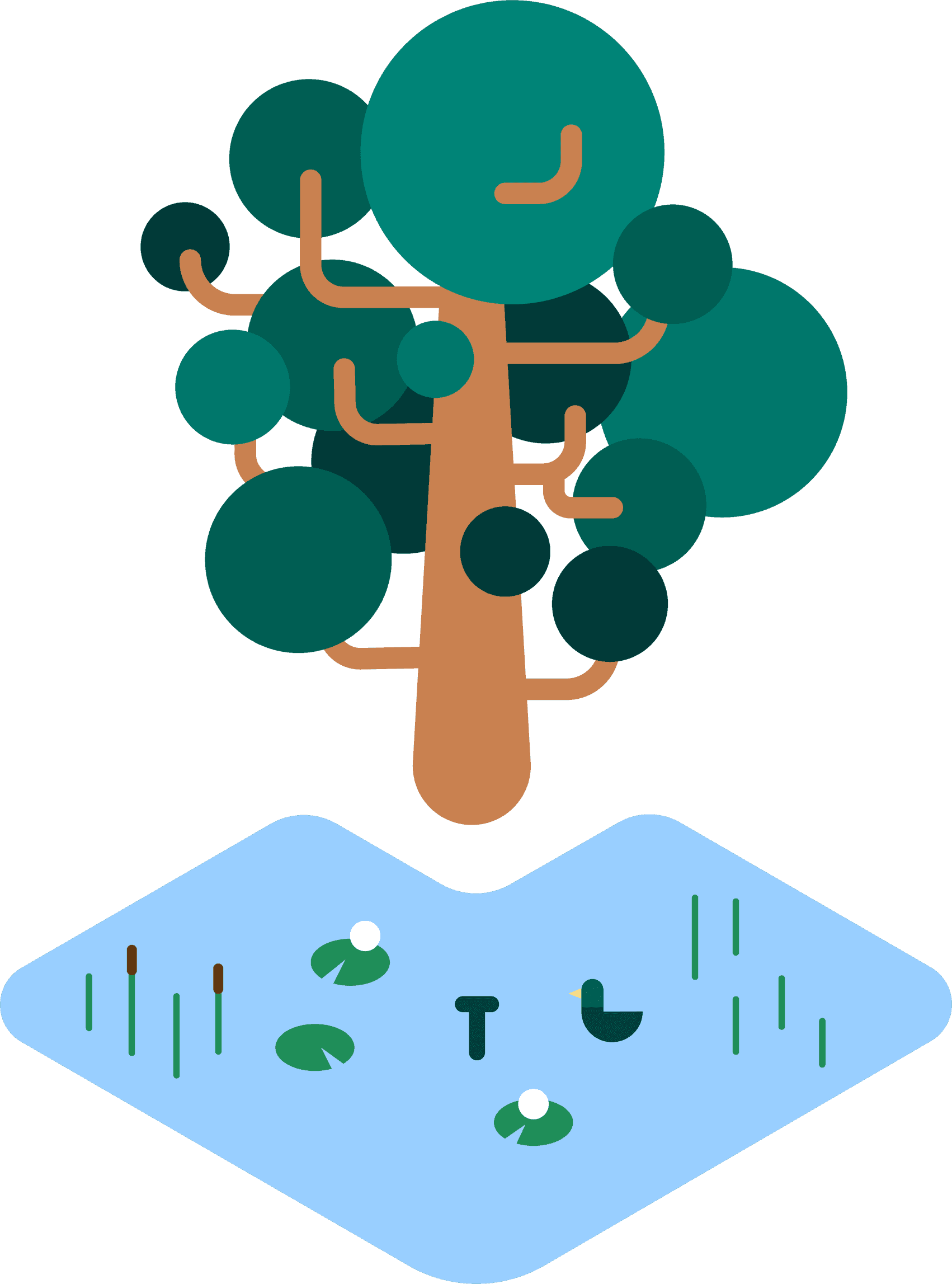
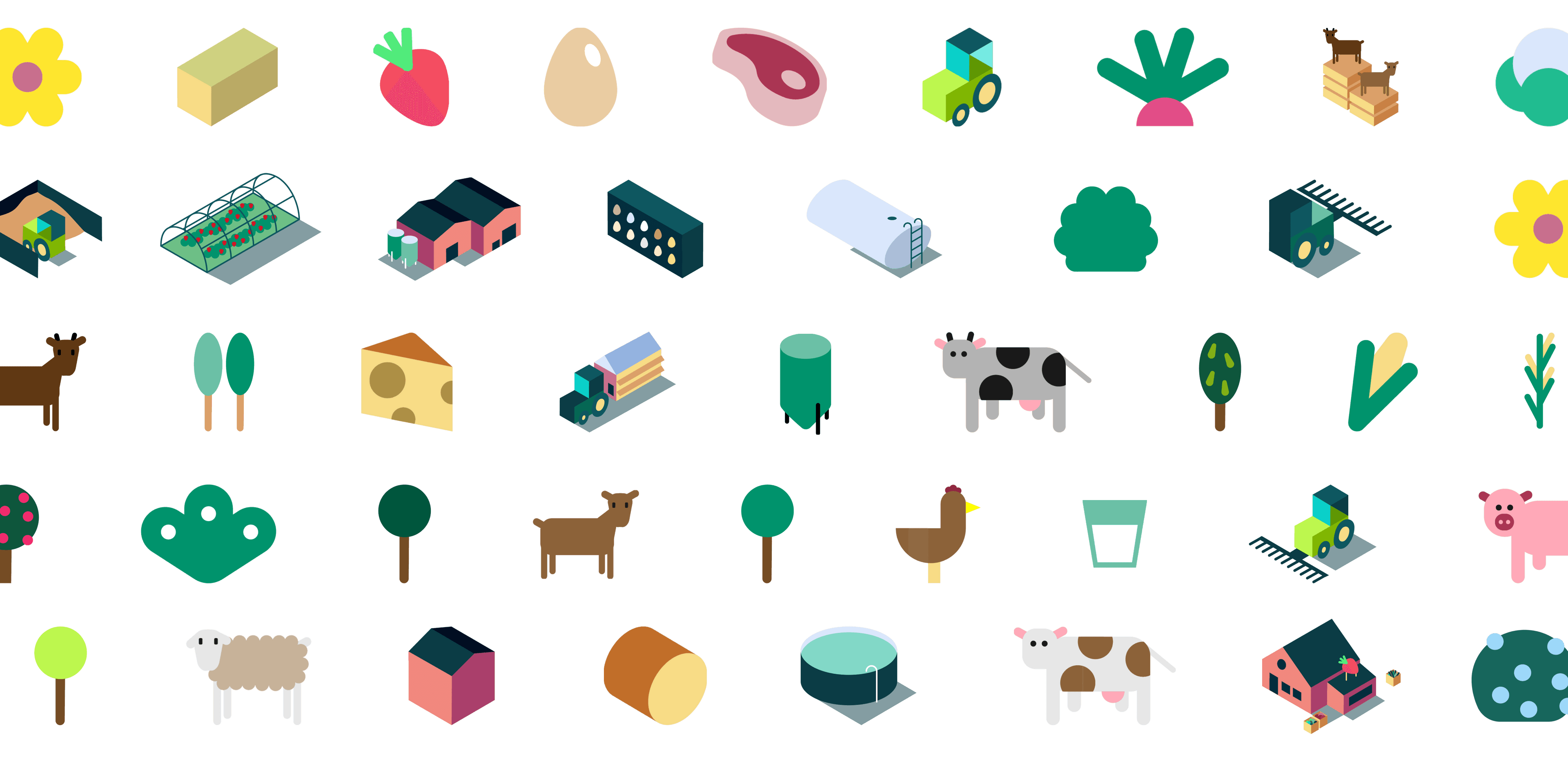
For the visual style, we landed on a charming and colorful design. Its minimalist approach makes it easy to understand for every child, yet allows us to create a unique, and recognizable personality for Boerderleren
Finally, the isometric perspective allows us to switch between 2D and 3D, while keeping the same design feel. Precious, playful and interesting to look at.
Have a look yourself at boerderleren.be