Client Case: Raf Simons — Studio Hyperdrive
- #digital
- #platform
- #desktop
- #mobile
- #development
Curious how we craft digital brand showcases? Let’s connect!
The general concept
Raf Simons' new website needed to be more dynamic in terms of content, reduce excessive noise concerning the brand, provide more recurrent visitors, and invigorate unique content.
Together with our colleagues at design agency ‘Mirror Mirror’, we subsequently prepared three pillars, which allowed us to approach the project, from the initial sketch to the finished project.
To give Raf Simons as much control as possible over the redesigned website, we helped Mirror Mirror in developing and deploying a user-friendly CMS.
Combining that with best-in-class hosting, we're allowing users to navigate the site quickly and intuitively worldwide, all without worrying about technical issues such as latency or server load.
This way the website remains fast and responsive, even in an environment with very high traffic volumes.
Putting the brand first
To make sure that the new site could respond to the different needs and expectations of its visitors, the redesign was split into two different elements; an informative element and an inspiring element.
For the informative element, a variety of elegant pages were provided that all give a comprehensive look at practical information.
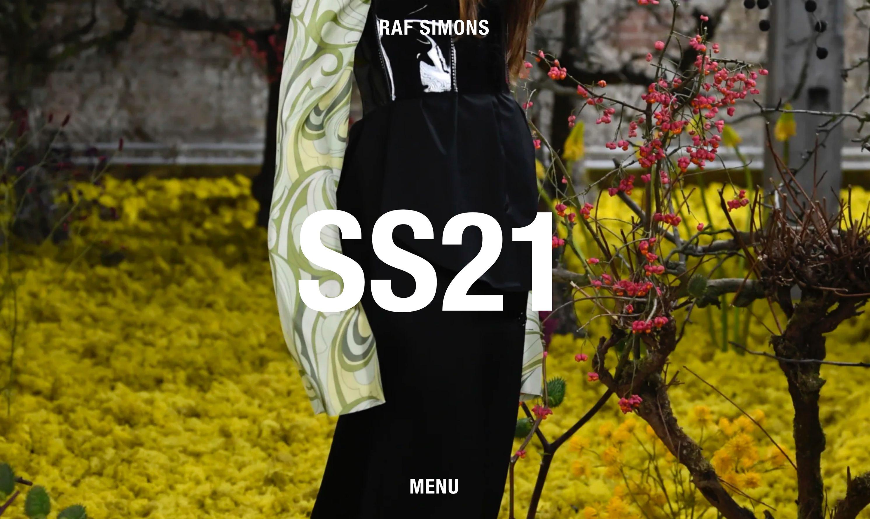
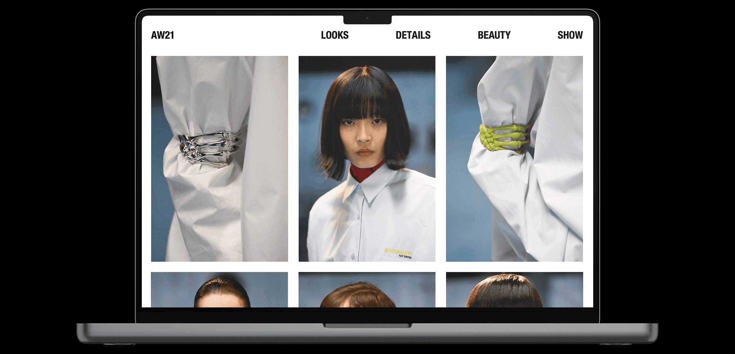
Furthermore, the inspiring element of the website was created by a minimalist layout, striking visuals, a light and dark background, and negative space.
Ultimate dynamism in design
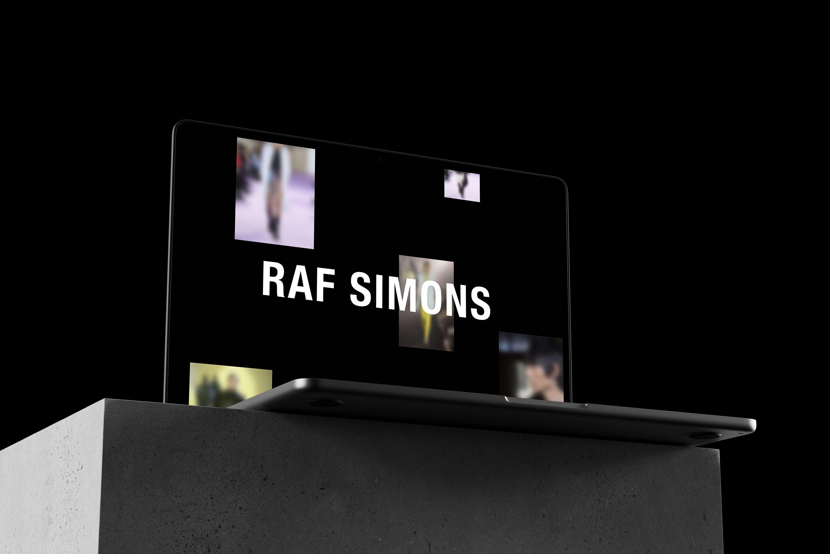
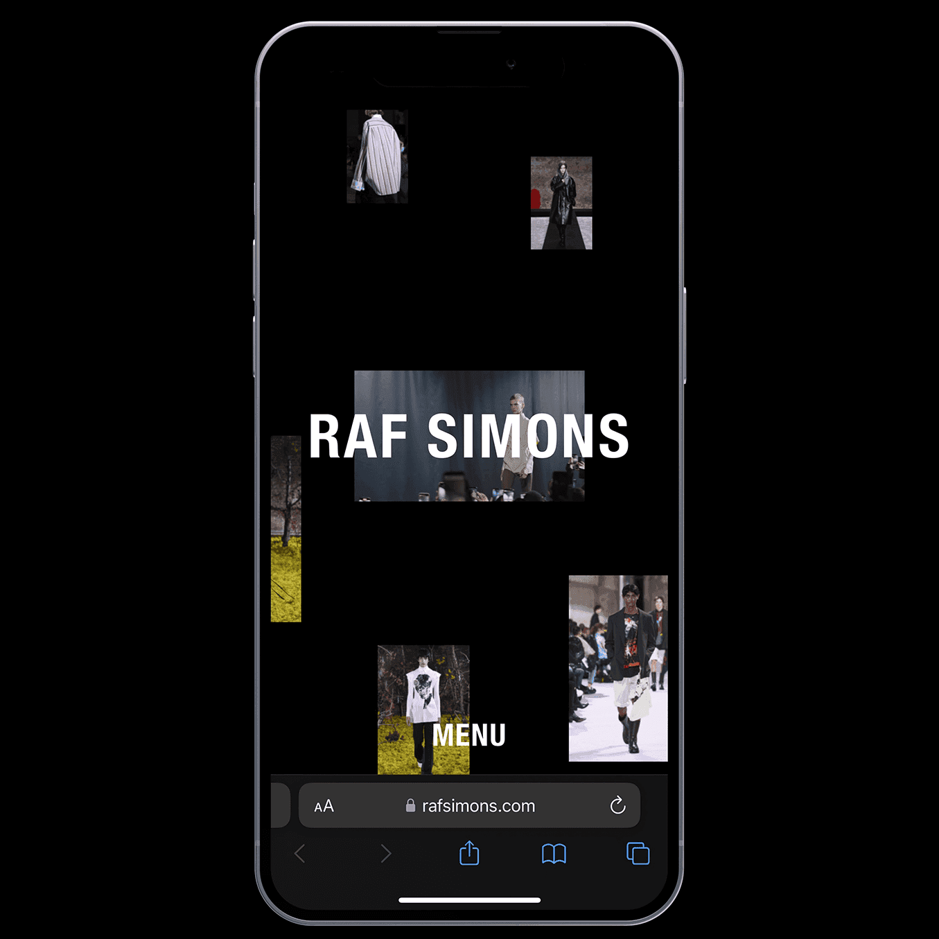
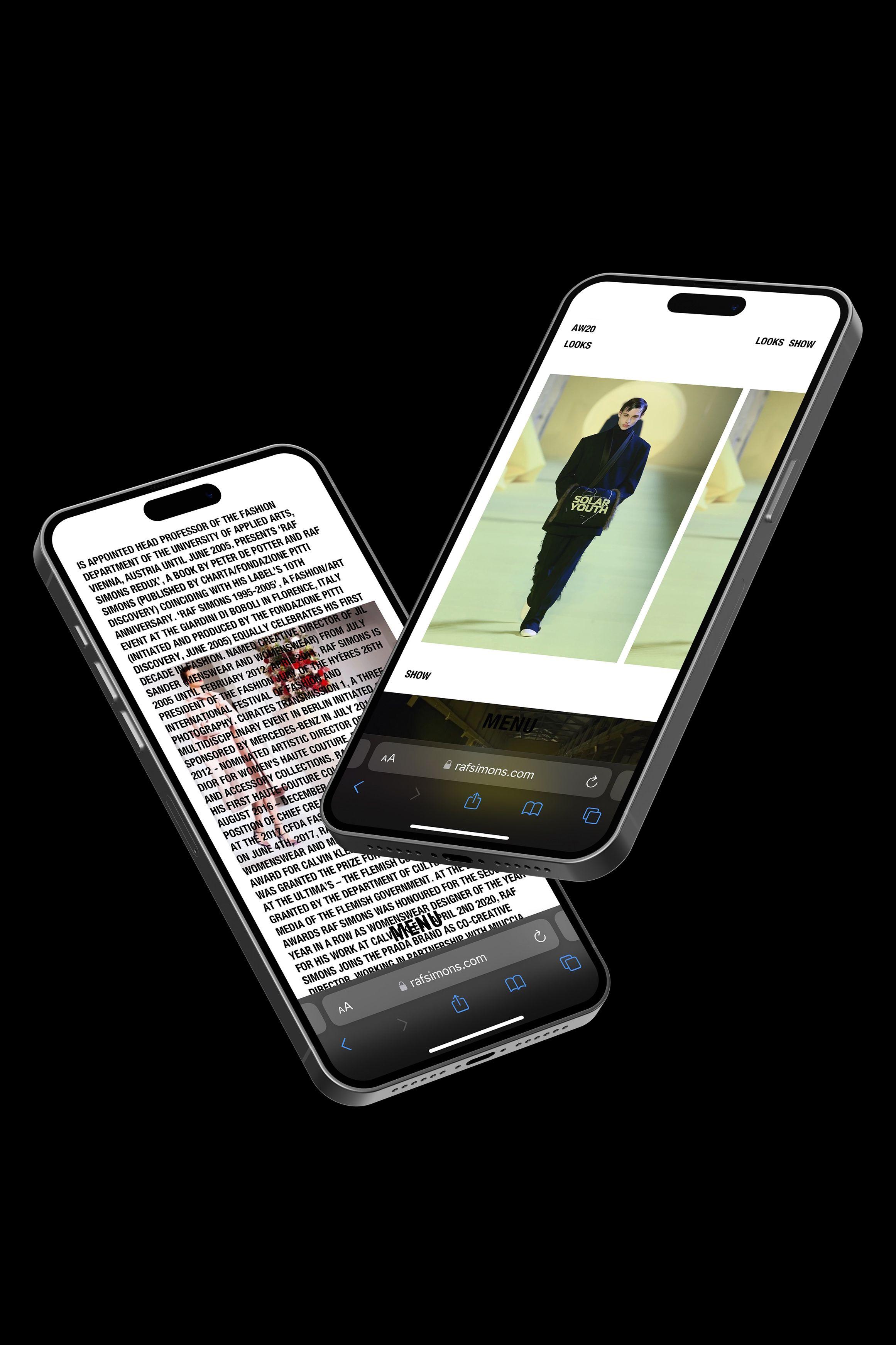
The UI is additionally joined by smooth animations, engaging scroll, video integration, and other design solutions to present the expansive content collection of the Raf Simons brand. The landing page then shows an infinite grid based on pictures, videos, and audio fragments, which provides the ultimate way of showcasing the ‘World of Raf Simons’.
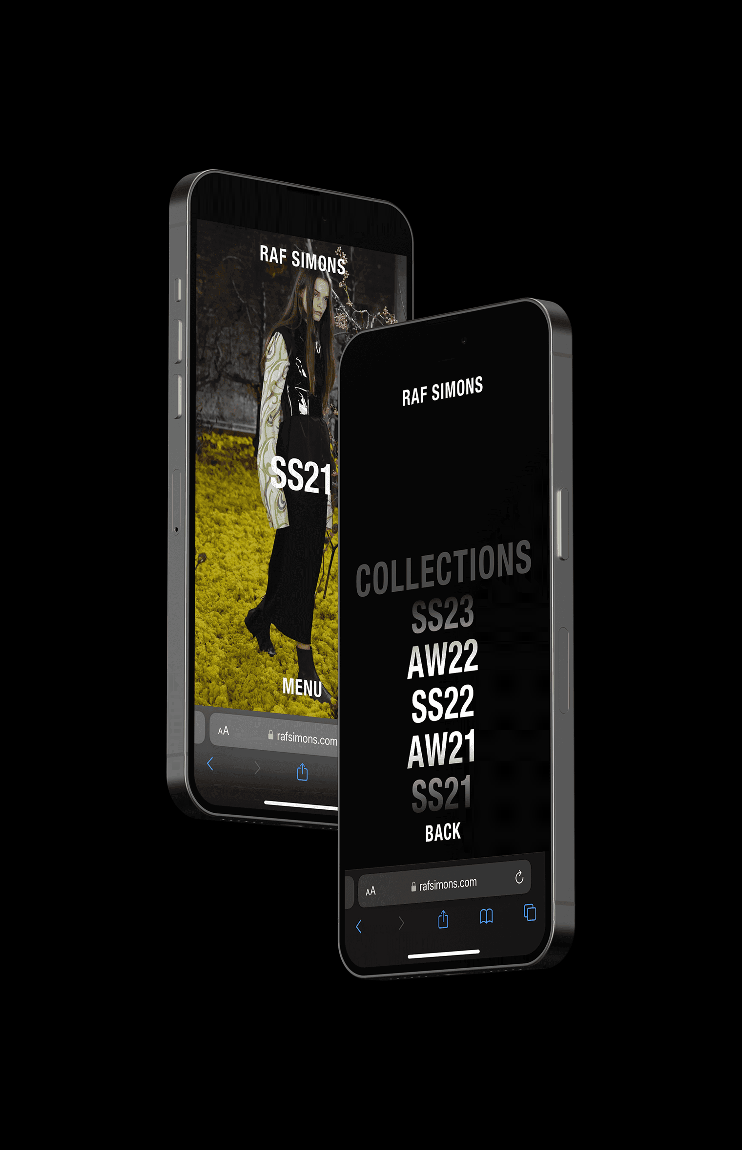
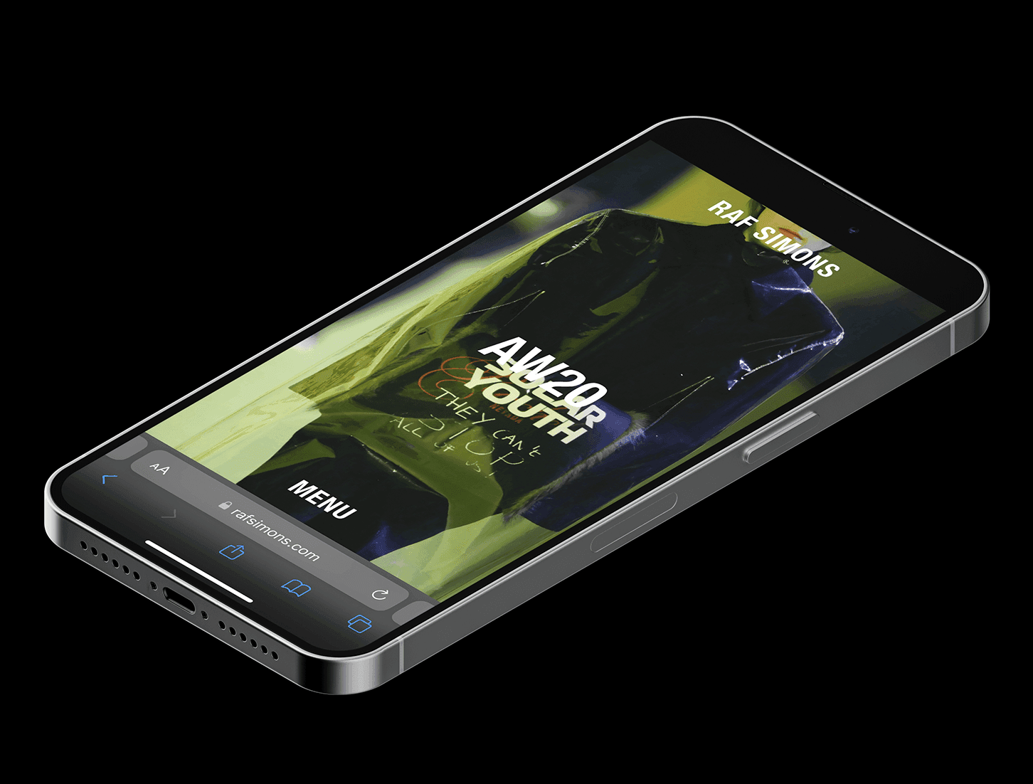
To make the redesign appear beautiful and consistent regardless of the device or location it is visited from, we thoughtfully adapted the UI to the tablet and mobile versions and made sure no compromises were made during the development and deployment.
“Offering an idealized culmination of the Raf Simons brand, whilst providing ultimate control and independence.”

Optimal content management
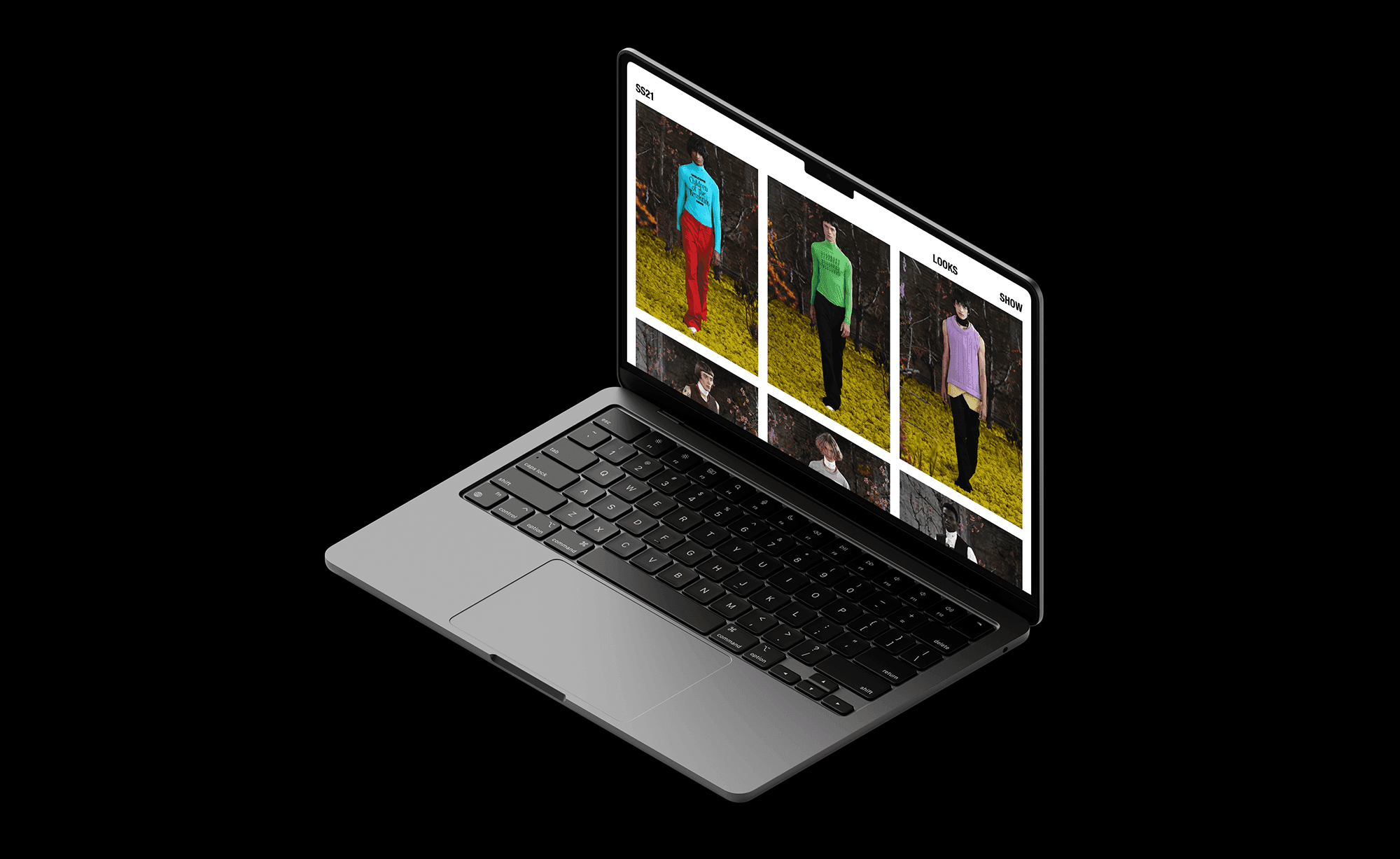
To make sure that certain resources are used optimally and efficiently, a system was built that is completely tailored to existing and new content sources. The images that are for example displayed on the landing page, are randomly generated for each visit.
This allows the visitor to see new highlighted content whenever one chooses to visit the site, providing an extra dynamic element to the website.
Forward, always.
Even though Raf Simons has announced that he would be shuttering his eponymous clothing brand, we are sure that his legacy will inspire many more generations to come. This makes us even more proud to have been able to contribute to creating a brand-new digital showcase for the brand. Making sure Raf Simons continues shaping the industry.
Have a look yourself at rafsimons.com